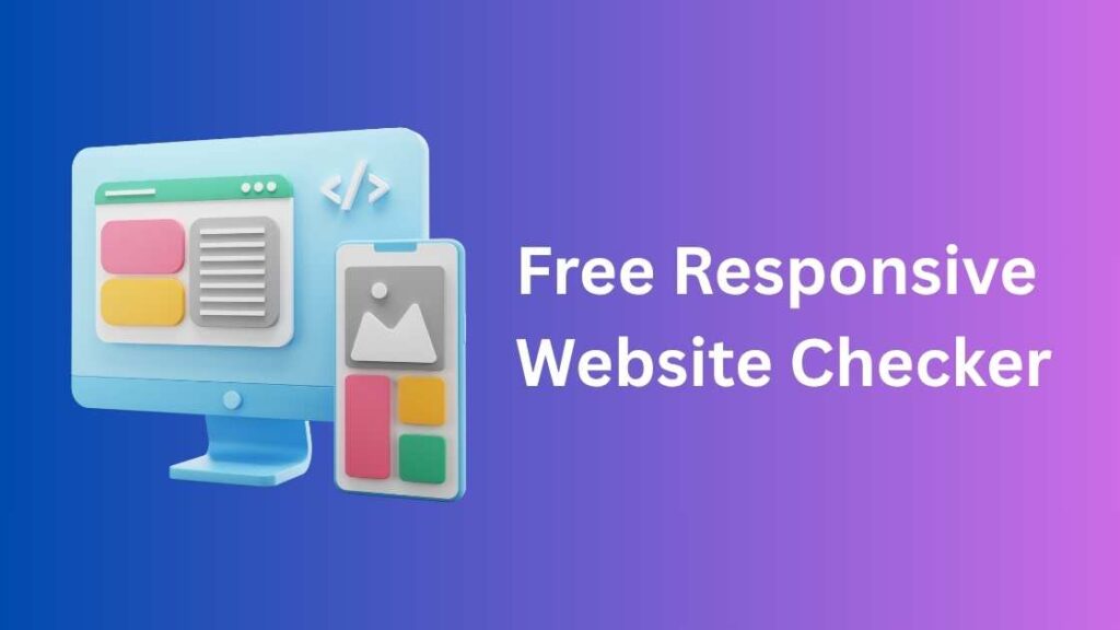
Free Responsive Website Checker – Test Mobile & Desktop Views Instantly
Free Responsive Website Checker – Easily test your website’s responsiveness across multiple devices with our free online tool. Preview your site on desktops, tablets, and smartphones including the latest models with live URL testing, device rotation, and multi-view options. No technical skills required!
Responsive Website Test Tool
Open on Mobile
Free Responsive Website Checker : Ensure Your Website Looks Perfect on Any Device
A responsive website is no longer a luxury—it’s a necessity. In an era where users switch between smartphones, tablets, laptops, and desktops throughout the day, your website must adapt to every screen size seamlessly. Our Free Responsive Website Checker makes it easy to test your website’s responsiveness in just seconds.
Whether you’re a web developer launching a new site or a business owner wondering why mobile users are bouncing, this tool gives you the visibility you need.
🌐 What Is a Responsive Website?
A responsive website automatically adjusts its layout, text size, images, and navigation based on the screen size and orientation of the user’s device. Whether it’s a 4-inch mobile phone or a 27-inch monitor, the content should look good and function perfectly.
Responsive web design ensures:
Readability without needing to zoom
Navigation that’s touch-friendly
Fast loading times across all devices
Consistent branding and experience
✅ Why You Need a Responsive Website Checker
Even if your site seems mobile-friendly, there could be hidden issues like:
Cut-off text or images
Buttons too small to tap
Overlapping elements
Slow mobile performance
A responsive website checker uncovers these problems by visually simulating how your site performs on real devices. This helps you:
Fix UX/UI bugs
Improve SEO
Boost conversions
Deliver a flawless user experience
🛠️ Core Features of Our Free Responsive Website Checker
Here’s what sets our tool apart:
Live Device Preview
Test your website in real-time across various device resolutions—smartphones, tablets, laptops, and desktops.Custom Screen Widths
Go beyond presets! Manually enter custom dimensions to test your layout on any screen size.Orientation Switch (Portrait/Landscape)
Preview how your content adapts when users rotate their phones.Compare Views Side-by-Side
View your website on multiple devices simultaneously to spot layout inconsistencies.Downloadable Screenshot Previews
Take screenshots of your responsive views for team collaboration or documentation.No Installation Needed
100% browser-based and free forever. Just enter your URL and start testing.
📲 Devices You Can Simulate with This Tool
Our Free Responsive Website Checker simulates various popular devices, including:
Mobile Phones: iPhone SE, iPhone 14, Samsung Galaxy, Pixel
Tablets: iPad, iPad Pro, Android tablets
Laptops: MacBook, Surface, standard 1366×768
Desktops: 1920×1080, 2560×1440, and more
You can test both portrait and landscape views for real-world behavior.
💡 Best Practices for Responsive Web Design
Here are some quick tips to ensure your website remains perfectly responsive:
Use fluid grid layouts with relative units like %, vw, vh
Apply CSS media queries to adjust styles at key breakpoints
Optimize image sizes and enable responsive scaling
Avoid Flash and outdated plugins—use HTML5 instead
Make buttons large and spaced out enough for touch
Test frequently using responsive checkers and real devices
📈 SEO Benefits of a Mobile-Responsive Website
Google now uses mobile-first indexing, meaning the mobile version of your website determines your rankings. If your mobile layout is broken, slow, or hard to use, it negatively impacts:
Search rankings
Click-through rates
User engagement
Bounce rates
Using a Free Responsive Website Checker ensures your mobile version meets Google’s usability standards.
🎯 Who Should Use a Responsive Website Checker?
This tool is perfect for:
Web developers & designers testing their front-end layouts
Digital marketers optimizing for conversions
SEO experts ensuring mobile usability
Freelancers & agencies delivering responsive projects
Ecommerce store owners verifying product pages & checkout on phones
Bloggers wanting better mobile readability
🔄 How Often Should You Check Website Responsiveness?
It’s a good idea to test:
Every time you launch a new page or blog post
After a theme or layout change
When you add new plugins or scripts
After updating your CMS or template
At least once a month as part of your maintenance routine
🚀 Get Started with the Free Responsive Website Checker
Responsive design is critical to user satisfaction and business growth. Our Free Responsive Website Checker gives you the tools to preview, identify, and fix mobile layout issues without the need for technical expertise.
✅ No sign-up
✅ No fees
✅ Instant results
🔗 Enter your URL now and see how responsive your website really is!